Flutter – Dialogs
The dialog is a type of widget which comes on the window or the screen which contains any critical information or can ask for any decision. When a dialog box is popped up all the other functions get disabled until you close the dialog box or provide an answer. We use a dialog box for a different type of condition such as an alert notification, or simple notification in which different options are shown, or we can also make a dialog box that can be used as a tab for showing the dialog box.
Types of dialogs in a flutter
- AlertDialog
- SimpleDialog
- showDialog
AlertDialog
Alert dialog tells the user about any condition that requires any recognition. The alert dialog contains an optional title and an optional list of actions. We have different no of actions as our requirements. Sometimes the content is too large compared to the screen size so for resolving this problem we may have to use the expanded class.
Properties:
- Title: It is always recommended to make our dialog title as short as possible. It will be easily understandable to the user.
- Action: It is used to show the content for what action has to perform.
- Content: The body of the alertDialog widget is defined by the content.
- Shape: It is used to define the shape of our dialog box whether it is circular, curved, and many more.
Constructor:
AlertDialog(
               {
                   Key key,
                   Widget title,
                   EdgeInsetsGeometry titlePadding,
                   TextStyle titleTextStyle,
                   Widget content,
                   EdgeInsetsGeometry contentPadding: const EdgeInsets.fromLTRB(24.0, 20.0, 24.0, 24.0),
                   TextStyle contentTextStyle,
                   List actions,
                   EdgeInsetsGeometry actionsPadding: EdgeInsets.zero,
                   VerticalDirection actionsOverflowDirection,
                   double actionsOverflowButtonSpacing,
                   EdgeInsetsGeometry buttonPadding,
                   Color backgroundColor,
                   double elevation,
                   String semanticLabel,
                   EdgeInsets insetPadding: _defaultInsetPadding,
                   Clip clipBehavior: Clip.none,
                   ShapeBorder shape,
                   bool scrollable: false
             }
)
Here is the snippet code for creating a dialog box.
- Dart
|
Output:
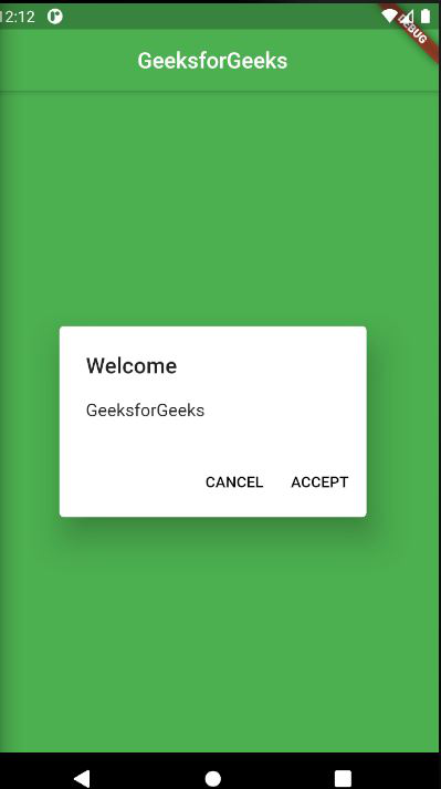
Alert dialog
SimpleDialog
A simple dialog allows the user to choose from different choices. It contains the title which is optional and presented above the choices. We can show options by using the padding also. Padding is used to make a widget more flexible.
Properties:
- Title: It is always recommended to make our dialog title as short as possible. It will be easily understandable to the user.
- Shape: It is used to define the shape of our dialog box whether it is circular, curve, and many more.
- backgroundcolor: It is used to set the background color of our dialog box.
- TextStyle: It is used to change the style of our text.
Constructor:
const SimpleDialog(
     {
               Key key,
               Widget title,
               EdgeInsetsGeometry titlePadding: const EdgeInsets.fromLTRB(24.0, 24.0, 24.0, 0.0),
               TextStyle titleTextStyle,
               List children,
               EdgeInsetsGeometry contentPadding: const EdgeInsets.fromLTRB(0.0, 12.0, 0.0, 16.0),
               Color backgroundColor,
               double elevation,
               String semanticLabel,
               ShapeBorder shape
     }
)
Here is the snippet code for Simple dialog
- Dart
|
Output:
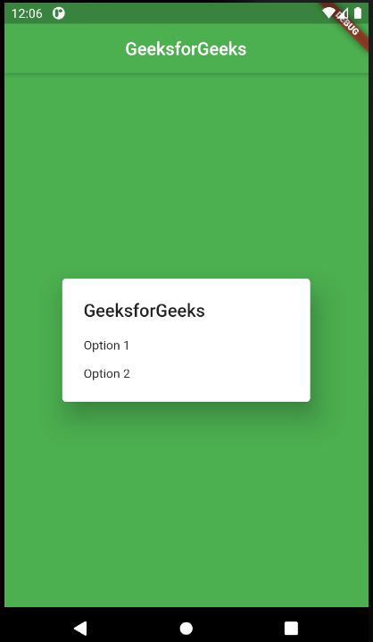
SimpleDialog
showDialog
It basically used to change the current screen of our app to show the dialog popup. You must call before the dialog popup. It exits the current animation and presents a new screen animation. We use this dialog box when we want to show a tab that will popup any type of dialog box, or we create a front tab to show the background process.
Properties:
- Builder: It returns the child instead of creating a child argument.
- Barriercolor: It defines the modal barrier color which darkens everything in the dialog.
- useSafeArea: It makes sure that the dialog uses the safe area of the screen only not overlapping the screen area.
Constructor:
Future showDialog (
    {
           @required BuildContext context,
           WidgetBuilder builder,
           bool barrierDismissible: true,
           Color barrierColor,
           bool useSafeArea: true,
           bool useRootNavigator: true,
           RouteSettings routeSettings,
          @Deprecated(It returns the child from the closure provided to the builder class ) Widget child
     }
)
Here is the snippet for the showDialog function.
- Dart
|
Output:
Key Difference
AlertDialog
- Used to show any type of alert notification.
- We can give the option to react to the alert popup like the accept button or reject button.
SimpleDialog
- Used to show simple options as a dialog box.
- There are different options to choose from and perform functions according to them. The option can be simple like choosing between different emails.
ShowDialog
- Used to create an option that will popup a dialog box.
- By using this we can popup different types of dialog boxes like alertDialog, and SimpleDialog as a sub widget.

0 comments