how can use material checkbox in android
How can use material checkbox in android
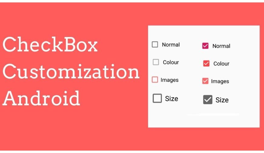
Checkboxes are available in the Material library for Jetpack Compose. To facilitate the creation of the CheckBoxes, Android provides the android.widget.CheckBox class. Instead of using the default settings, we can also customize the UI of view elements in Android. Thus, different images of the checkbox can also be added to the layout. The CheckBox in Android can be understood as a type of two-state button. Here, the two-state means that it can be either checked or unchecked. Checkboxes can be used to serve various purposes such as selecting the hobbies of a user and to activate/deactivate a specific action. The CompoundButton class in Android has a subclass named CheckBox class.
Example of Custom CheckBox:
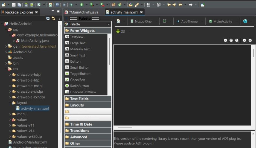
activity_main.xml: (File: activity_main.xml)
checked.xml: unchecked.xml: custom_checkbox.xml: (File: custom_checkbox.xml) To customize the checkbox we will implement a selector in the checkbox.xml file under the drawable folder. Activity class: (File: MainActivity.java)
|


0 comments