Icon Class in Flutter
Icon class in Flutter is used to show specific icons in our app. Instead of creating an image for our icon, we can simply use the Icon class for inserting an icon in our app. For using this class you must ensure that you have set uses-material-design: true in the pubsec.yml file of your object.
Syntax:
Icon(
      key key,
      size,
      color,
      semanticLabel,
      textDirection
)
Properties:
- color: It is used to set the color of the icon
- size: It is used to resize the Icon
- semanticLable: It comes in play while using the app in accessibility mode (ie, voice-over)
- textDirection: It is used for rendering Icon
Note: The semanticLabel are not visible in the UI.
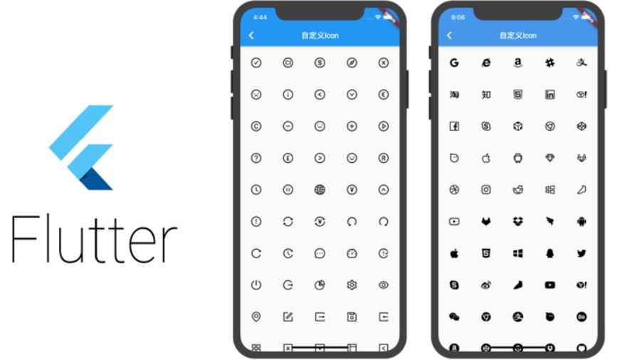
A few of them are depicted below:
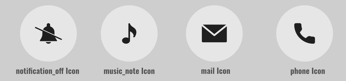
To view, the complete list of Icons click here.
Let’s see some of those icons in action with simple flutter apps.
Example:
Here we will design an app that shows various icons on different tabs. Here we will have 5 tabs with 5 icons each and we will alter its properties to view the UI changes. The property changes are as below:
- music_note Icon:
properties:
color: default, size: 100, semanticLabel: None, textdirection: default
- music_video Icon:
properties:
color: default, size: 100, semanticLabel: None, textdirection: default
- camera_alt Icon:
properties:
color: default, size: 100, semanticLabel: 'Camera', textdirection: default
- grade Icon:
properties:
color: red, size: 300, semanticLabel: 'Star', textdirection: default
- email Icon:
properties:
color: default, size: default, semanticLabel: None', textdirection: default
- Dart
|
Output:


0 comments