What is widgets in Flutter?
Flutter
is Google’s UI toolkit for crafting beautiful, natively compiled iOS and Android apps from a single code base. To build any application we start with widgets – The building block of flutter applications. Widgets describe what their view should look like given their current configuration and state. It includes a text widget, row widget, column widget, container widget, and many more.
Widgets: Each element on a screen of the Flutter app is a widget. The view of the screen completely depends upon the choice and sequence of the widgets used to build the apps. And the structure of the code of an apps is a tree of widgets.
Category of Widgets:
There are mainly 14 categories in which the flutter widgets are divided. They are mainly segregated on the basis of the functionality they provide in a flutter application.
- Accessibility: These are the set of widgets that make a flutter app more easily accessible.
- Animation and Motion: These widgets add animation to other widgets.
- Assets, Images, and Icons: These widgets take charge of assets such as display images and show icons.
- Async: These provide async functionality in the flutter application.
- Basics: These are the bundle of widgets that are absolutely necessary for the development of any flutter application.
- Cupertino: These are the iOS designed widgets.
- Input: This set of widgets provides input functionality in a flutter application.
- Interaction Models: These widgets are here to manage touch events and route users to different views in the application.
- Layout: This bundle of widgets helps in placing the other widgets on the screen as needed.
- Material Components: This is a set of widgets that mainly follow material design by Google.
- Painting and effects: This is the set of widgets that apply visual changes to their child widgets without changing their layout or shape.
- Scrolling: This provides scrollability of to a set of other widgets that are not scrollable by default.
- Styling: This deals with the theme, responsiveness, and sizing of the app.
- Text: This displays text.
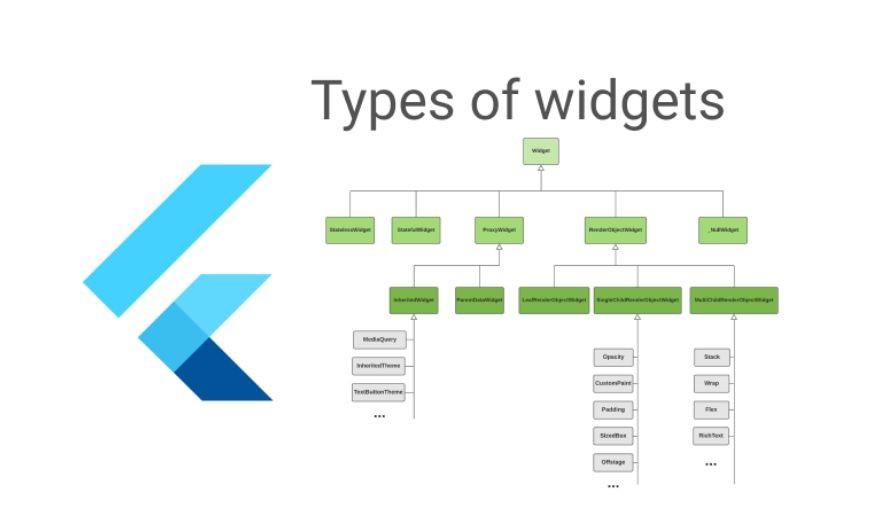
Types of Widgets:
There are broadly two types of widgets in the flutter:
- Stateless Widget
- Stateful Widget
WIDGET
Fig – Widget
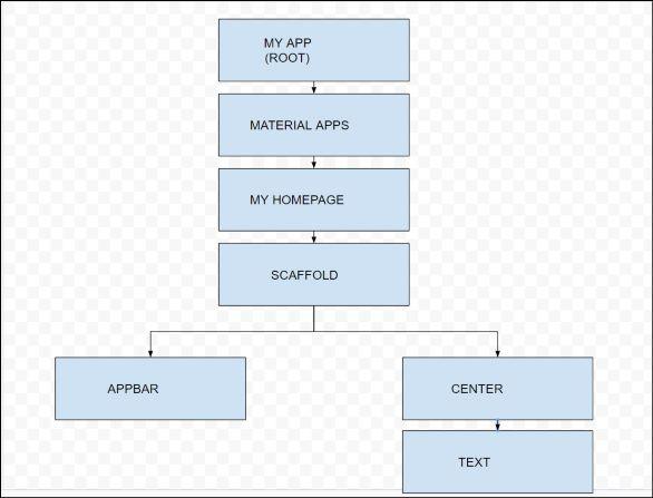
Example: The Layout Tree of basic app screen using Stateless Widgets:
- Dart
|
Example: The Layout Tree of basic app screen using Stateful Widgets. This also produces the same results as the above code.
- Dart
|
Description of the widgets used are as follows:
- Scaffold – Implements the basic material design visual layout structure.
- App-Bar – To create a bar at the top of the screen.
- Text To write anything on the screen.
- Container – To contain any widget.
- Center – To provide center alignment to other widgets.
Output:
0 comments