
Flutter – Circular & Linear Progress Indicators
Progress Indicator in any application displays the time which is needed for some tasks to complete such as downloading, installation, uploading, file transfer, etc. This shows the progress of a tas...

Flutter – Dialogs
The dialog is a type of widget which comes on the window or the screen which contains any critical information or can ask for any decision. When a dialog box is popped up all the other functions ge...
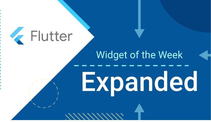
Expanded Class in Flutter
When we create any child of a row or column we provide the size of the widget according to the screen size but sometimes when we provide more size of child as compared to screen size we get a warni...
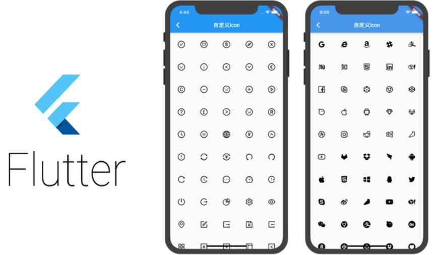
Icon Class in Flutter
Icon class in Flutter is used to show specific icons in our app. Instead of creating an image for our icon, we can simply use the Icon class for inserting an icon in our app. For using this class y...

Flutter – Expansion Tile Card
The Expansion Tile Card works similarly to that of the Flutter SDK’s standard expansion tile. But it uses the style used by Google itself in its products to raise a tile. It can be called a better...
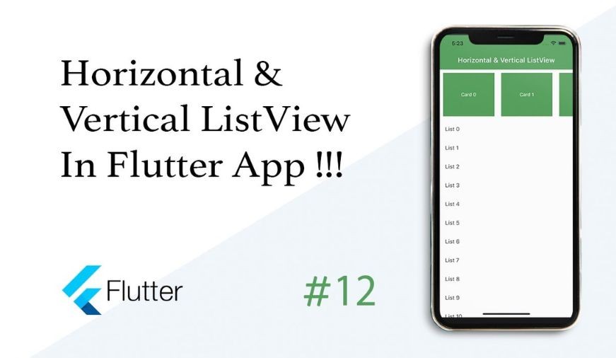
Flutter – Horizontal List
In Flutter there can be Two types of lists, namely, horizontal list and vertical list. Both these lists are created using the Read More

Flutter – Tabs
Tabs are exactly what you think it is. It’s part of the UI that navigates the user through different routes(ie, pages) when clicked upon. The use of tabs in applications is st...

Flutter – RichText Widget
The RichText widget is used to display text that uses various different styles. The displayed text is described using a tree of TextSpan

Flutter – AppBar Widget
AppBar is usually the topmost component of the app (or sometimes the bottom-most), it contains the toolbar and some other common action buttons. As all the components...

Drawer Widget in Flutter
Drawer Widget is used to provide access to different destinations and functionalities provided in your application. It is represented by three horizontal parallel lines on the...